Determining the Emigre Magazine Index (Part 2)
People, hierarchies, contributions, and a designer-authored magazine
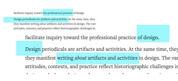
This is the second in a series of short essays based on my Emigre magazine project, which I published in Design & Culture journal as “Designing the Emigre Magazine Index: Theory and Practice in an Alternative Research Tool” (need access? The A.M. version is on my website here).
The Emigre Magazine Index interface can be used here (via archive.org)
📖 You can read Part 1 of this series here.
To prototype is to build an idea. As designers, we’re prototyping things all the time, whether it’s through drawing, writing, constructing, or maybe coding. My approach is the one I also teach: weaving prototyping into research, in a way that encompasses cycles of critical observation and documentation existing at the same level as creating. The hierarchies can be flattened.
As I mentioned in my last post, knowing who or what to look for within the sixty-nine issues of Emigre required some prior knowledge of the magazines. This reinforced the need to create a type of finding tool. My next step involved documenting the issues.
Paging through the issues of Emigre magazine (a.k.a. my content review in a climate-controlled museum storage room, with outside temps soaring above 100F), I saw the magazine’s lifespan was a continual reshaping of itself based on its social, political, economic, or cultural contexts and contributions. There were people who wrote things, people who designed things, people who produced things, printed things, and whatnot.
Each issue is a prototype. There’s a timeline of digital technology showing through the issues, starting with prominent raw digital design aesthetic in the early issues, and moving to polished spreads, both of which fade over time. There is also an aspect of collective authorship that stands out and needs to be communicated.
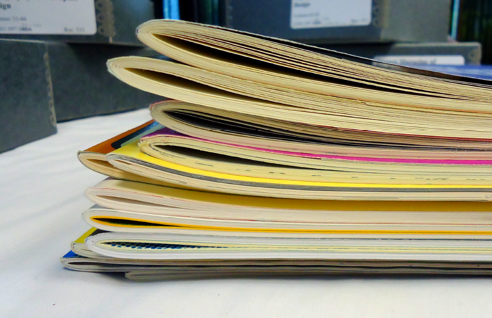
Visually and materially, the magazine changes over time, and these details are in my original article (links at the top).
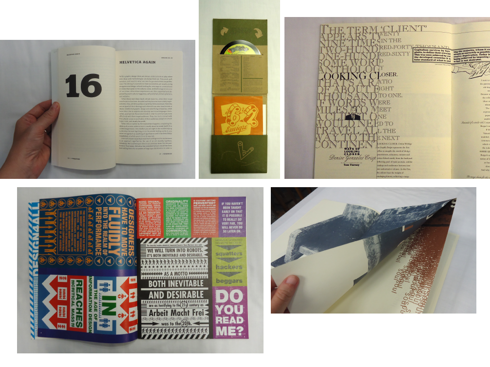
At its start in 1984, Emigre’s single page dimensions were 11x17.5 inches with full-color covers. There’s an exploration of graphic layering, typography, juxtapositions, and attention paid to how design is read and in effect, how it's also written. Licko’s typefaces begin showing up in the third issue. In 1995 there was a major size reduction, and the magazine size changed slightly to be approximately 8.5x11 inches. There are more advertisements, and there’s a more polished and systematic approach — dare I suggest, it’s more refined. Letters to the magazine from readers begin to appear in most issues, and they’re gathered under a heading, The Readers Respond.
In 2001 the dimensions dropped in size again, down to approximately 6x8.5 inches. These issues, numbers 60–63, are multimedia and are structured as mailers for a CD/DVD. In 2003, another format change happened with issue 64 moving toward the look and feel of a paperback book at 5.25x8.25 inches. These issues were co-published with Princeton Architectural Press, and they're mostly written content. The exploratory graphic layouts are gone, and issue 68 is a book-length letter to Emigre from a reader. The magazine’s lifespan ends with issue 69 and includes notes from Rudy VanderLans, along with Emigre, friends, and readers.

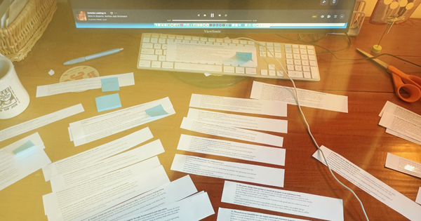
After sorting through these material dimensions, and issue themes, I began documenting all the author names and their contributions in every single issue. The challenge wasn’t in the volume of data to record — it was in figuring out what to document, and how to do so (and I’m not referring to office supplies!)
Some of the questions that I contemplated as I was working through this were pretty big ones, and they played a major role in how I eventually constructed the index. These surrounded the issue of acknowledging the magazine’s authorship and giving visibility to the various roles that gave it life.
Does a written article hold more weight than a page of visual work, or vice versa? What’s the hierarchy, or are they treated as equal contributions?
How to handle a type design credit for a font used in a specific article?
Would it make sense to include people like printers, distributors, and copy editors?
What are ways to record the many people who wrote letters to the editors?
For interviews, what’s the best way to credit both the interviewer and the interviewee?
💡 These questions have informed my research agenda over the past decade, and continue to do so.
Graphic design products are inclusive of their designers, writers, and producers. When building a finding tool for a magazine like Emigre, these questions become very significant: how its contents are identified and organized — and their hierarchies — inevitably affects how a future person assigns value.
In the next part of this series, I’ll discuss building and finishing the finding tool — for which Emigre gave their thumbs up! — and which was eventually completed indoors during the dark, freezing temps of a Minnesota winter.
This post is public so feel free to share it.