Text of Writing as Visual
A few thoughts on showing voices, times, places, and media on the page.
The focus of this essay snuck into my Sunday morning breakfast. Between coffee sips and omelet bites, I tried to talk through this idea (through rapid hand gestures and uttering a series of disjointed thoughts thinking out loud) to my sleepy husband (who looked at me blankly and kept chewing). Coincidentally, or perhaps ironically, the fog outside thickened and onto a scrap of paper I began to scribble this essay.
Visually oriented writings combine some elements of design and, of course, text. This description is barely adequate, however, as visual writing is already text and written language is designed. *sigh*
I’ll show what I mean rather than continue to mess up a convoluted description.
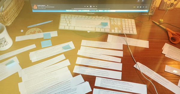
As I put together the small collection of page examples below, a couple things are worth noting:
- First off, these pages are all readable. I mean, you can actually read the text. Caveat: if it’s not readable, that too could be intentional by design, as it still impacts the message communicated to the reader.
- Second, the visual choices support meaning rather than merely decorating a page. The design decisions shape and reflect the book’s core content.
In my writing projects, it’s a struggle to write and not think about these things. But it’s problematic to develop these visual ideas before I even write the text. Result? Creative paralysis. *sigh*
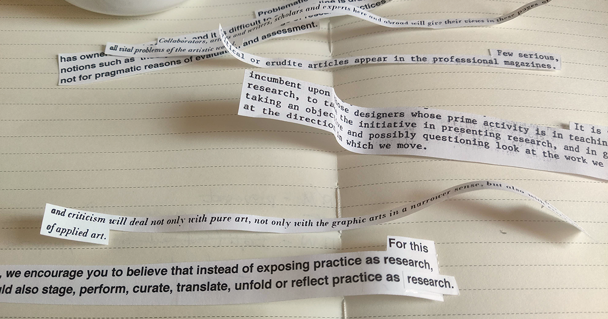
Imagine these examples on a spectrum of complexity. Some push visual boundaries and others deepen stories by adding textual components. I thought it worth sorting them here. Side note: I’ve added a link for each book in the photo caption, but be sure to check your local library too.

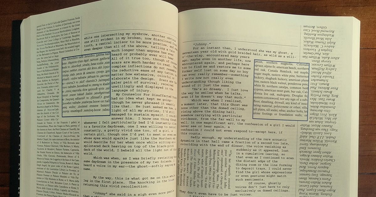
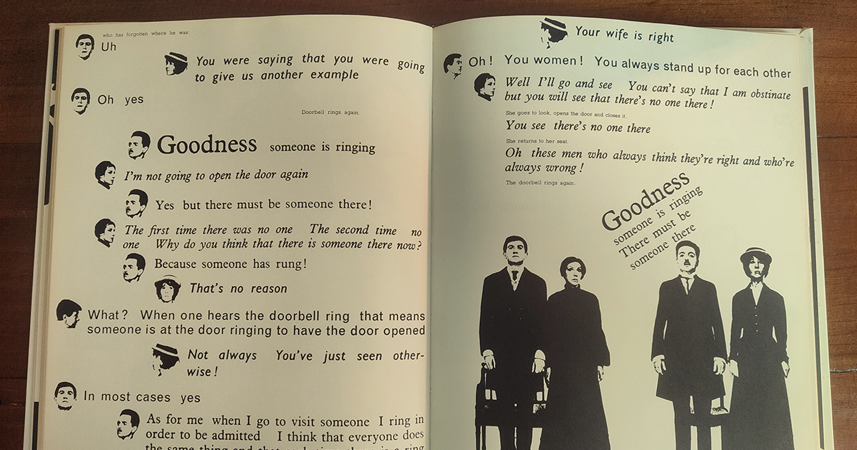
House of Leaves was designed by its author, and throughout the story, it unfolds spatially and with the strategic use of white space. Sure, sometimes you need a mirror to read it, but who doesn’t love a reading challenge now and then?1 As The Bald Soprano progresses, the visual text treatments become increasingly disruptive. Here, however, the text aims to mirror the characteristics of a theatrical performance, complete with all the actors. The designer employs a different typographic treatment and a tiny head (custom emoji!) to let the reader know who is speaking.
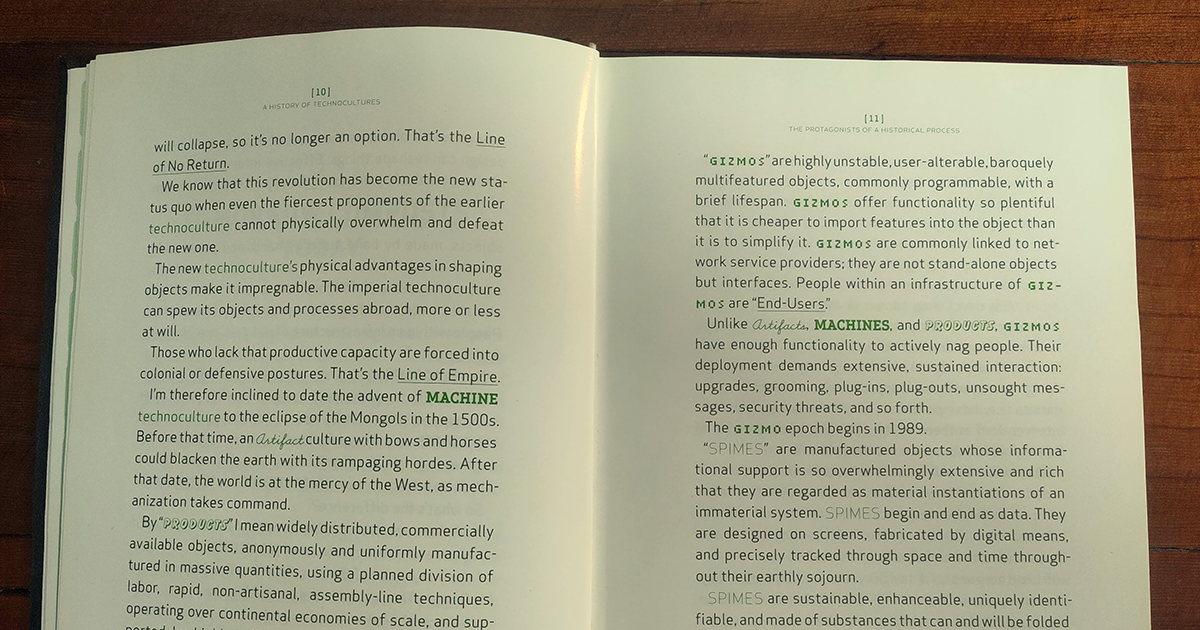
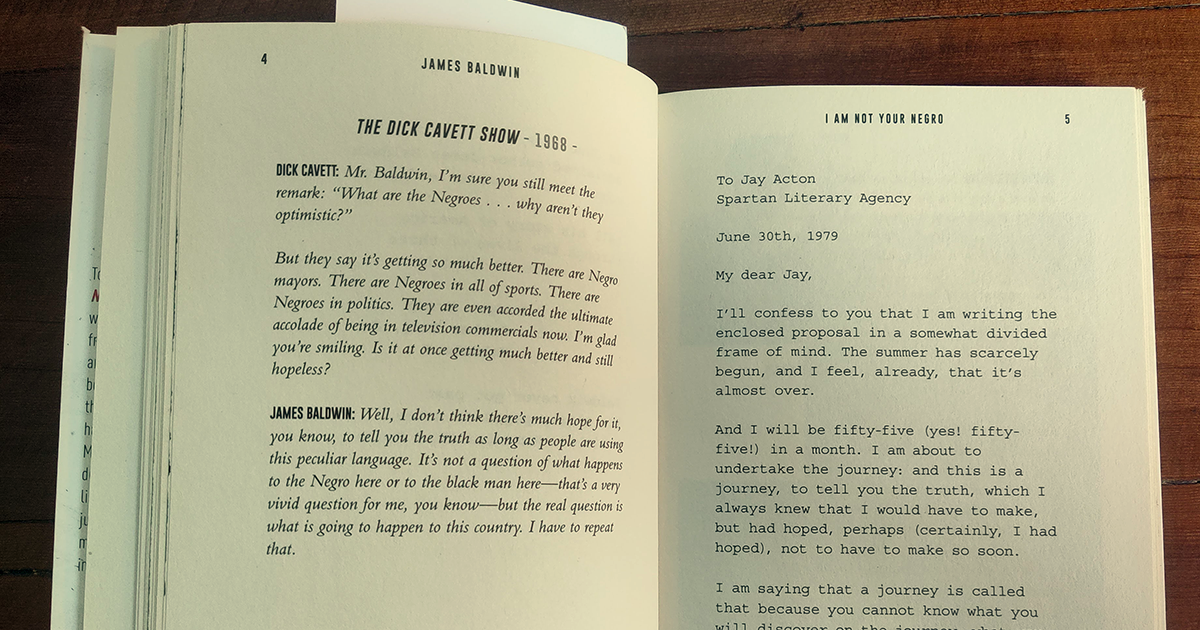
Throughout Shaping Things, certain words get graphical makeovers, a way for the designer to literally ‘shape things’ within the text. I’d also argue that these words double as a kind of visual index. Meanwhile, I Am Not Your Negro takes form as a collection of Baldwin's works assembled into a cohesive and flowing text. The shifts in typeface and position indicate various types of literature, including interviews, poetry, and correspondence.
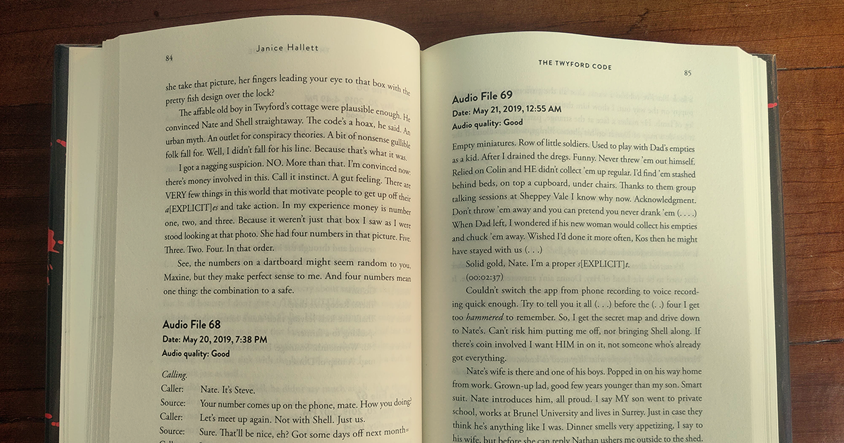
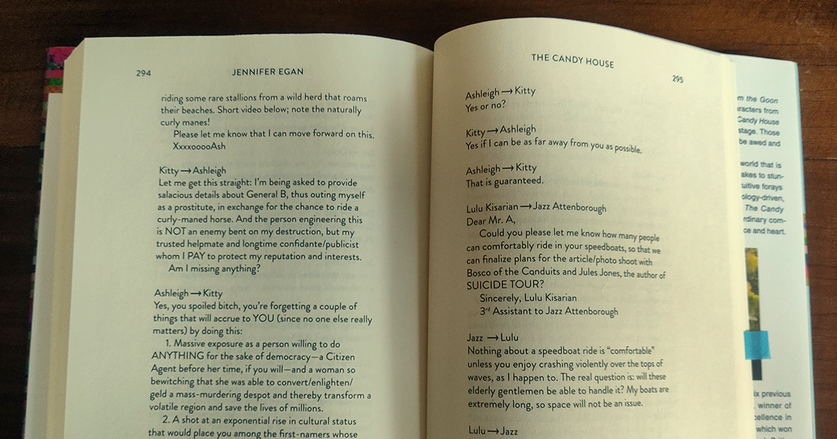
My last two examples are here because they visually reference forms of communication media. The Twyford Code is written as a series of time-stamped audio files. This is done so elegantly that the reader gets familiar with this visual device. The flow of text and ideas is maintained throughout the book. Similarly, a chapter of The Candy House is written as a series of emails. Though they lack time-stamps, the small arrows successfully convey a narrative through conversational exchanges.

As I mentioned before, these examples range from subtle to graphically provocative. I’ve not separated fiction and non-fiction, because these visual treatments don’t discriminate! In all cases, the graphic elements of texts deviate from convention and change our reading experiences… and, hopefully, influences how we write.
For anyone interested in learning more about ‘weird book design’ such as House of Leaves: “When Book Design Gets Weird” from Incomplet Design History ↩