Constructing the Emigre Magazine Index (Part 3)
Tools are not neutral. And, cake tastes better with frosting.
Admittedly, I struggled to get this newsletter to you. It’s mid-January. Tonight, it will be cold, with -20°F windchills. Coffee and carbs make up a good portion of my diet. My dog and I slip and slide our way through our icy neighborhood. Beyond my “yeah, it’s another Great Lakes winter” attitude, however, I’ve got a few other things I’d like to share. But those will keep until next time.
Without further ado…
This is the third (and final) in a series of short essays based on my Emigre magazine project, which I published in Design & Culture journal as “Designing the Emigre Magazine Index: Theory and Practice in an Alternative Research Tool” (need access? The A.M. version is on my website here).
Here are links to Part 1 and Part 2 of this series. The Emigre Magazine Index interface can be used here (via archive.org)
An index is typically designed to allow for quick and clear access to information (many are text-based) and stand apart from the character of the content displayed. They provide information and guidance.
I didn’t adhere to those best practices (side note: should best practices be followed, or quietly ignored?), and following Emigre’s resolve to challenge the rules of established practice, the Index has color, graphics, interactivity, and animation. I decided the tool needed more experiential possibilities than a spreadsheet, and with interconnectedness that goes beyond static lists of information.
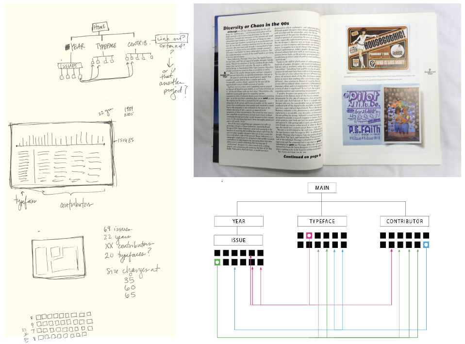
Visually and interactively, the Index is a metaphorical snapshot of the magazine. From issue to issue, the magazine’s visual aesthetics shifted. The interface itself plays off color and typographic treatments found within various magazine issues. I also saw the opportunity to reorganize the contents in a way that fundamentally alters hierarchies, and occupies a space in a way that only digital information can.
As I wrote the markup and javascript, I became more aware — downright ecstatic, in fact — that the Index itself is an argument. The tool is not neutral; it is designed to influence its users’ social and cultural perspectives of the magazine. The design centers on looping graphic navigational devices, inviting users to “read” Emigre data through viewing, reading, clicking, scrolling, printing, and playing.
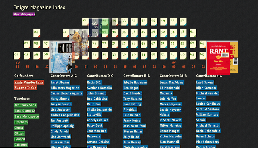
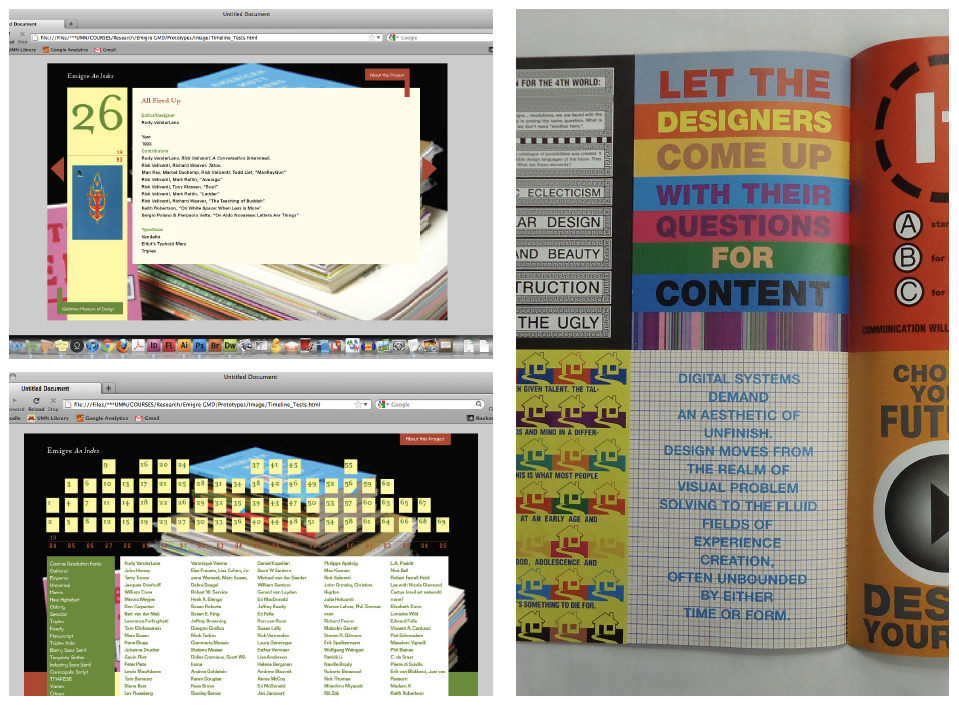
On the main page, the layout of the issues is also a timeline, inspired by keyboards and arranged vertically by year. The lower-right corner of each issue button bears one of four colors, with each indicating a particular size dimension of the magazine. When the pointer is moved over an issue button, cover art appears, growing in size and changing from transparent to opaque. My goal with this visual effect was to reflect the turning of a paper page.
Is the animation really necessary? Many would argue that it’s just frosting on a cake. Better to focus on making a really good cake. And to that, I say this: cake tastes better with frosting, doesn’t it?
This whole section of contributor and typeface names below this area presented a logistical dilemma: how does one arrange hundreds of names on a website so that they have equal prominence? Though my solution has its faults, I arranged them as if they were on a memorial or commemorative wall. Names are listed alphabetically in six columns, without drop-down menus or other sub-navigational features, to direct attention toward the mass number of contributors. There are no shortcuts.
There are three ways to start using the Index: select a numbered issue, a contributor name, or a typeface name. As a person finds a name by scrolling, they are compelled to at least visually acknowledge, and perhaps also reflect upon, the other names on screen. All main page links lead to subpages for an issue, person, or typeface. And the items on these pages are, of course, interlinked.
The Index is meant to play a role in conveying what the magazine is about, what it looks like, and who made it happen. My hope/wish/goal is that a person using the Index might start forming connections: How might discovering two seemingly distinct contributors in the same issue lead to connections between their works today? What insight might be gained from investigating the use of certain typefaces in music articles?
There just might be social, political, economic, and cultural insight yet to be uncovered within Emigre’s pages.
Though I am not affiliated with an archive or museum, another one of my goals with the Index is to challenge how digital finding tools might embrace the fact that they are informational as well as persuasive. Thankfully, the practices of digital scholarship are still being explored. By designing for interpretation and experience, we might also better understand the rhetorical character of designing research tools.
New practices call for new solutions. Current and future works that are authored or produced by designers will likely continue to make their way into institutional collections. They will need to be recorded, studied, presented, and made accessible. My hope hope/wish/goal is that the Emigre Magazine Index serves as a stepping-stone for continued discussion about designing tools through a reflective, critical process of making.
This post is public so feel free to share it.